What this article covers: How to read the ClaimScore Dashboard — what every section means, how to interpret scores and results, and how to navigate across cases. This article is useful both for admins who have just completed setup and for lawyers or team members joining an active case.
Getting to the Dashboard
Click Dashboard at the top of the left sidebar. At the top of the dashboard, you'll see two selectors:
Organization selector — If you belong to more than one organization, switch between them here.
Case selector — Switch between cases within the current organization. This is how you navigate across active, in-progress, and completed cases.
💡 If you were just invited to ClaimScore: Use the Case selector to find the case you've been given access to. Cases are listed by name. If you don't see a case you expect to see, you may have been added as an Organization Member but not yet assigned to that specific case — ask your admin.
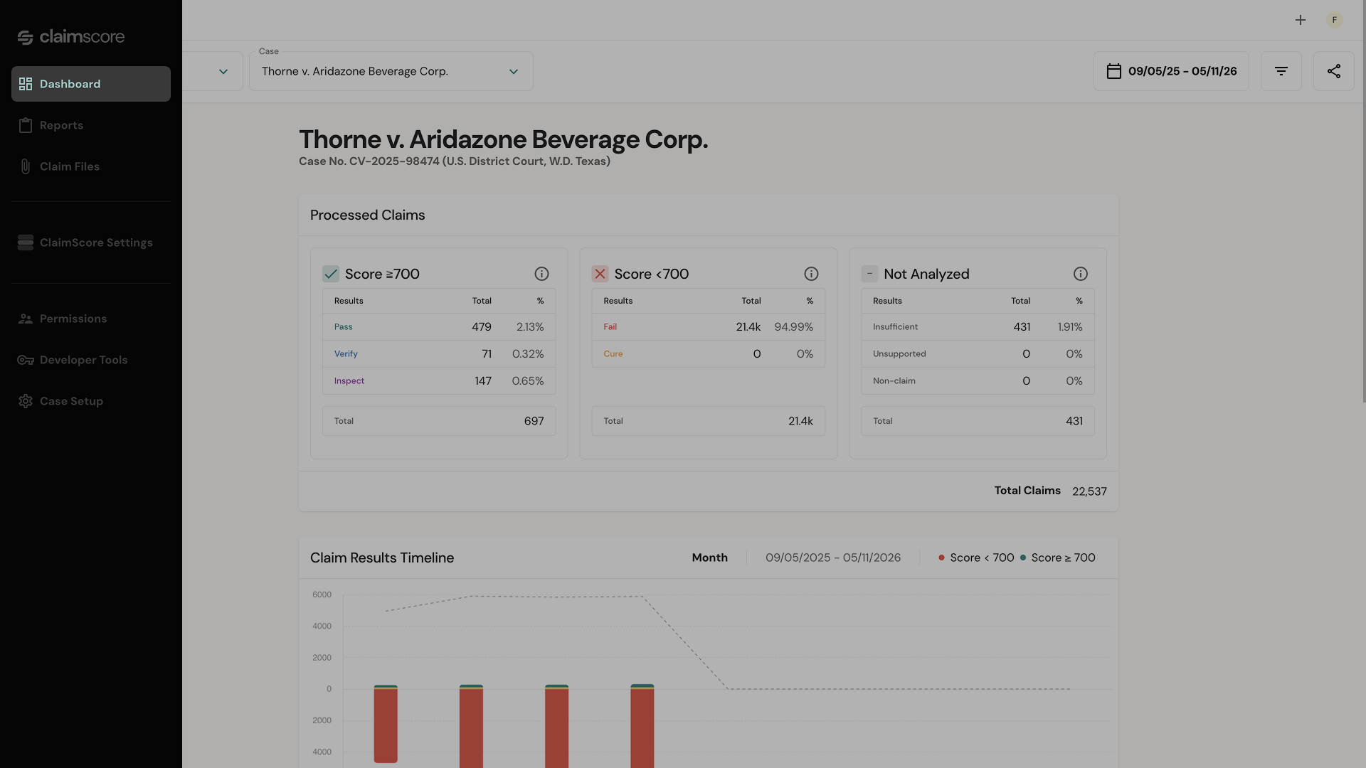
The Processed Claims Summary
At the top of the dashboard, you'll see three summary cards:
Card
What it means
Score ≥ 700 (Pass)
Claims that scored 700 or above. These passed ClaimScore's fraud thresholds and are
considered valid.
Score < 700 (Fail)
Claims that scored below 700. These have been flagged as potentially fraudulent or
invalid.
Not Analyzed (Insufficient)
Claims that could not be scored because they were missing required data fields.
Each card shows the count of claims in that category. This gives you an immediate read on the health of your claim population: how many passed, how many failed, and how many couldn't be evaluated at all.
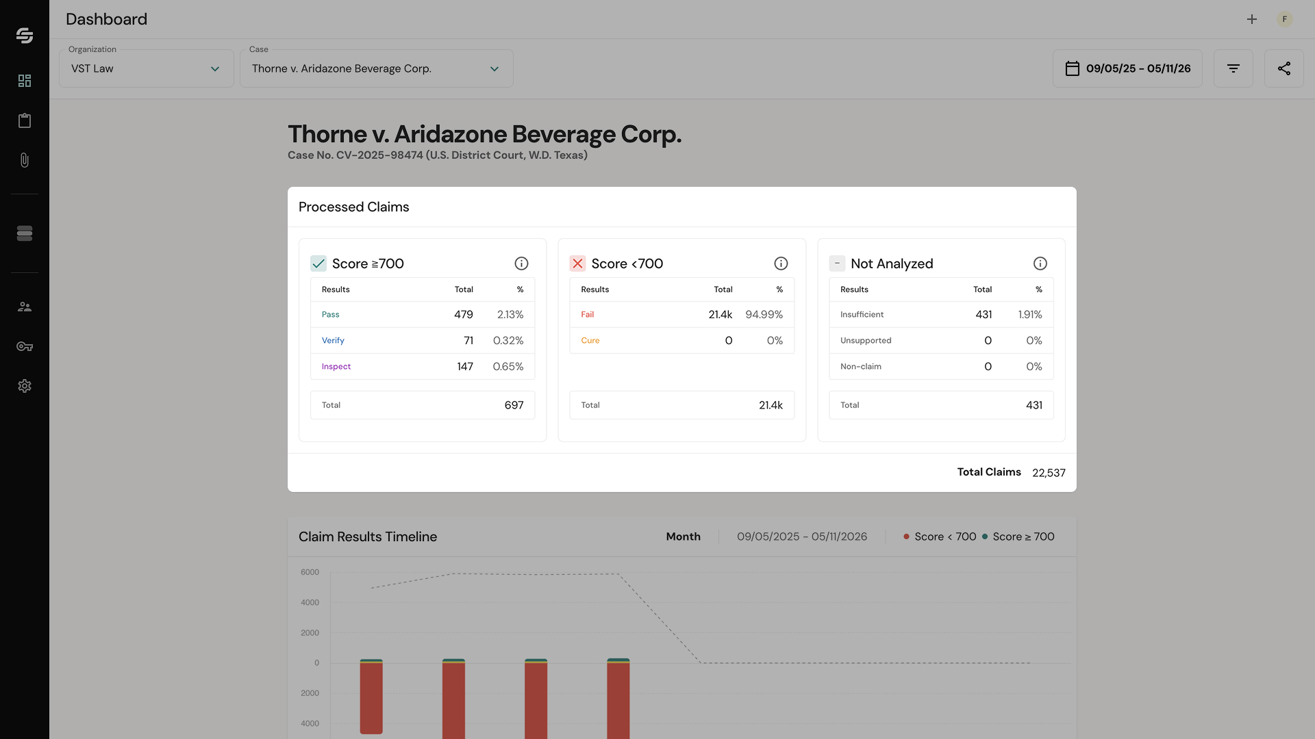
The Claim Results Timeline
Below the summary cards, a timeline chart shows claim submissions and scoring results over time. This chart helps you:
See when submissions were concentrated (e.g., a spike near the deadline)
Track how the pass/fail ratio has evolved as more files are processed
Identify unusual submission patterns that may warrant closer review
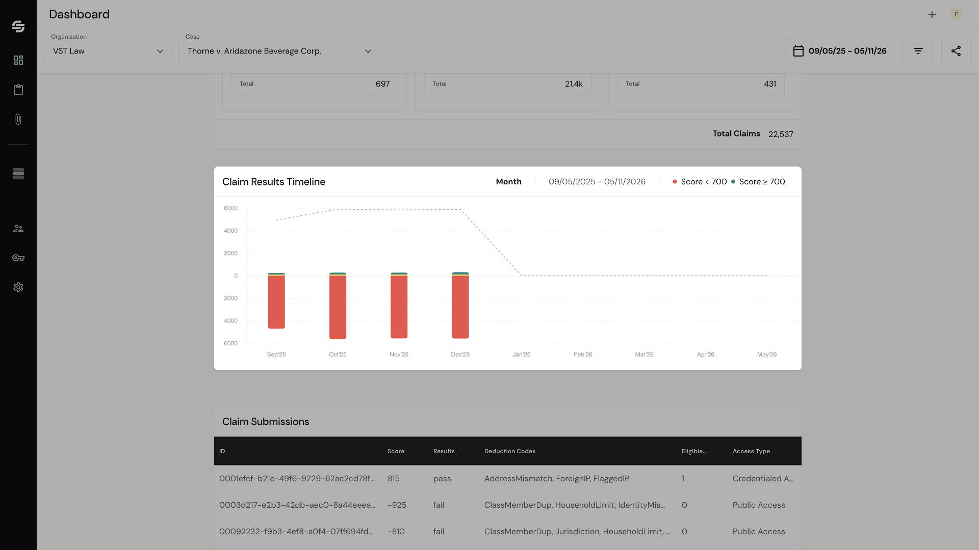
Spike Cards
ClaimScore surfaces spike cards to highlight a specific time interval where submission volume deviated significantly from the norm, giving you a focused view into what happened during that window.
Each spike card shows:
Date range — The start and end of the detected spike interval.
Total claims — The number of claims submitted during the spike.
Average claims per interval — The baseline comparison so you can see how far above normal the spike was.
Results breakdown — The percentage of claims during the spike that were Approved, Pending, and Rejected.
Top 3 Referrer Sources — The three referrer URLs associated with the most claims during the spike, with claim counts for each. A single source driving a disproportionate share of spike activity is worth investigating.
Top 3 Deduction Codes — The three most common deduction codes applied during the spike, with claim counts for each. Each deduction code corresponds to a specific fraud signal — for example, a shared IP address, an undeliverable address, or a duplicate identity. This tells you what type of fraud pattern was most active during the spike.
Spike cards are designed to draw your attention to the moments that matter most. Rather than scanning the full timeline yourself, they surface the intervals where concentrated or coordinated submission behavior is most likely.
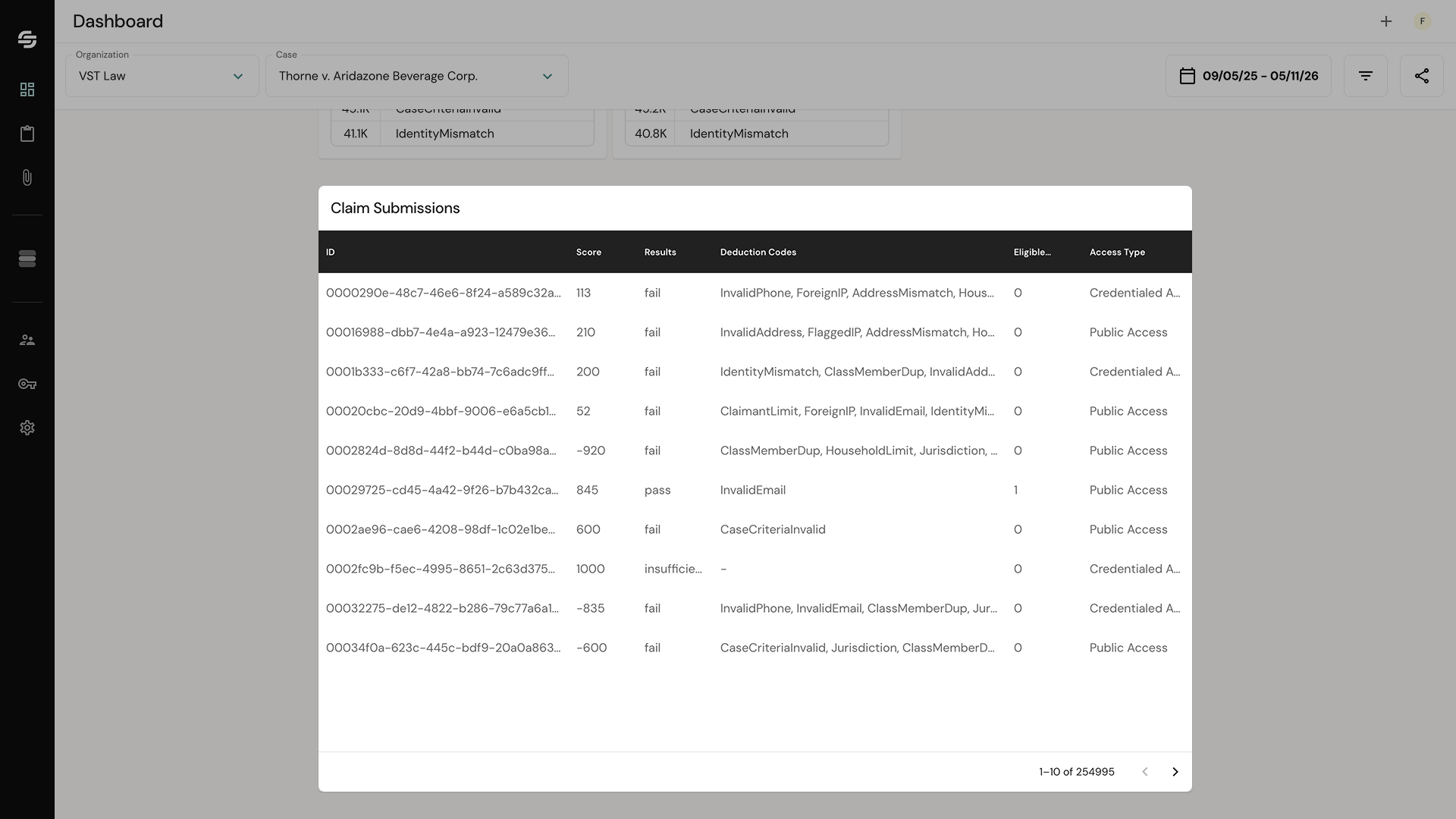
The Claim Submissions Table
At the bottom of the dashboard, a table shows individual claim records with their scores, results, and deduction codes. This is where you review specific claims.
For each claim you can see:
The claim's score
Its result (Pass / Fail)
The deduction codes applied (the specific reasons for any flags)